Blog · use-case
Post a diagram on LinkedIn, X or GitHub that people actually stop for
Hand-drawn diagrams stand out in a feed, and one that draws itself stops the scroll. Which Diagramly export to use on LinkedIn, X, GitHub and Slack, and how.
Explaining an idea with a diagram is the most reliable way I know to get an engineering post read. Everyone else is posting screenshots of text. A sketch is a picture, and a sketch that draws itself is a picture that moves. This is what that looks like, straight out of the export button:

The two-minute version
- Type the idea in the sketch line: /, then something like the line below.
- Give it a title (the field next to the logo) and tidy anything that needs it.
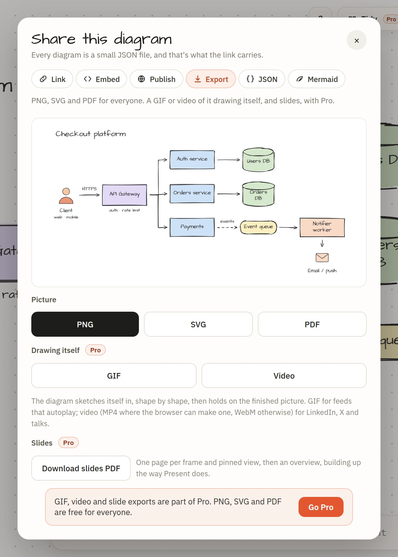
- Share → Export, and pick the format for the platform from the table below.
- Post it with two sentences of context and a link to the published page for people who want the detail.
Which format where
| Platform | Use | Why |
|---|---|---|
| Video (MP4) | LinkedIn doesn't animate GIFs in the feed; video autoplays muted | |
| X | GIF or video | Both autoplay; GIF loops, which suits a short build-up |
| GitHub README | GIF | READMEs render GIFs, not video |
| Slack, Discord, Notion | GIF | Unfurls and plays inline |
| A blog or newsletter | PNG or SVG, plus a GIF if the platform plays them | Stills load fast; SVG stays sharp at any size |
| Threads, Mastodon, Bluesky | PNG or video | Each handles GIFs differently; a still is the safe choice |
The GIF is 800 pixels wide at 20 frames a second and about five seconds long, under the size limits everywhere above. The video is 1280 pixels at 30 frames a second; Chrome and Safari make an MP4, Firefox makes WebM. Both are Pro exports. PNG and SVG are free.
Composing for a feed
- Fewer shapes than you think. Five to nine boxes is a post; twenty is a document. Put the rest on the published page and link to it.
- Landscape, not tall. Feeds crop tall images. The button by the sketch line sets the layout direction to left-to-right.
- One idea per diagram. "How our cache invalidation works", not "our architecture".
- Label the arrows. The labels are what people read first:
-(HTTPS)->,-(async)->,-(every 5 min)->. - Title it. The title becomes the file name and the link preview.
- Colour one thing. A fill on the one box that matters pulls the eye to it.
Give the post somewhere to go
Publish the diagram (Share → Publish, Pro) and it gets a page with a link preview, so the link under your post shows the diagram again. Readers can pan, zoom, press Present, and open their own copy to argue with it, which is the kind of reply you want.
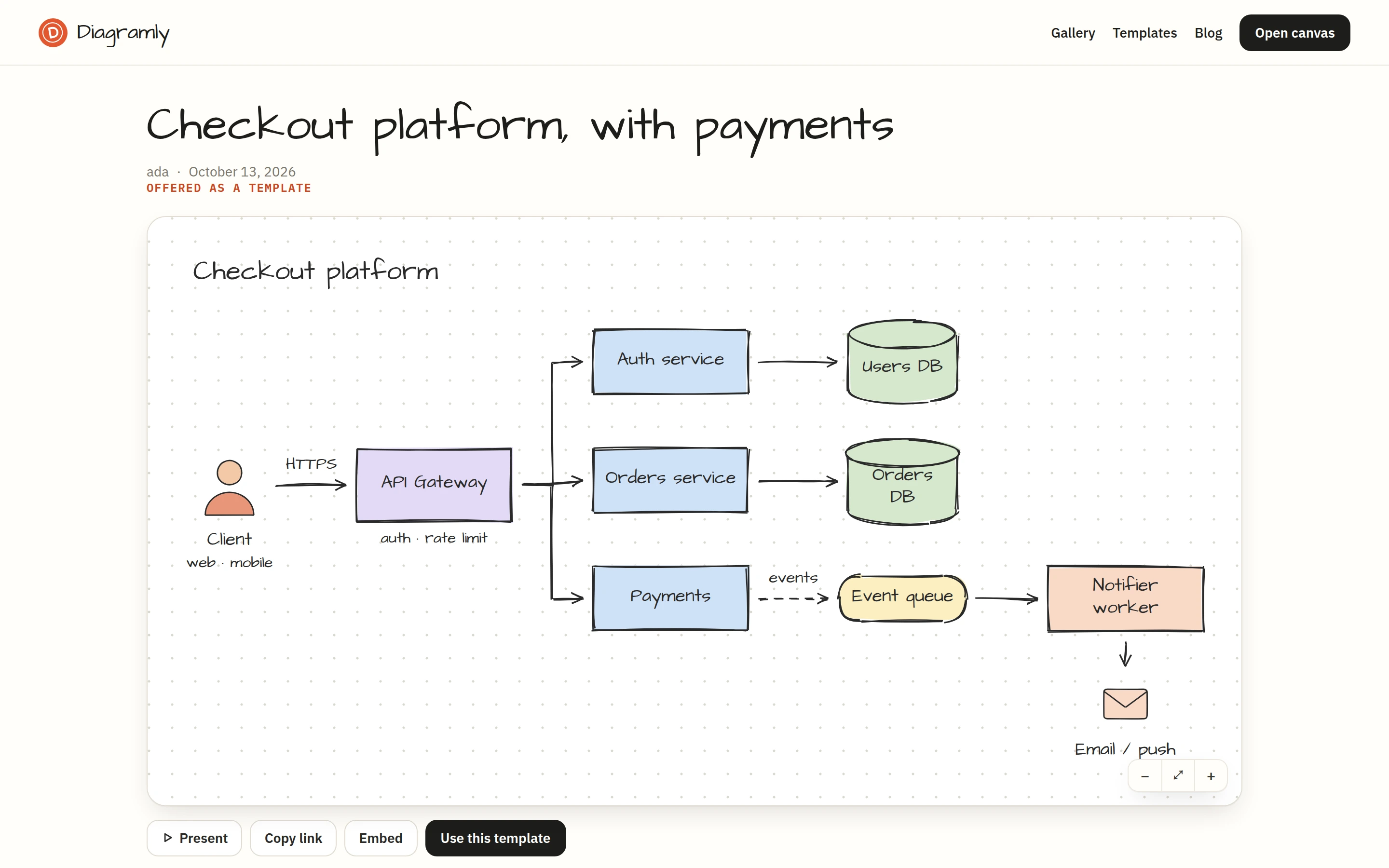
If you'd rather not publish, the view-only link from Share → Link does the same job without a public page. The whole diagram travels inside the link.
A caption that works
Two or three sentences: what the diagram shows, the one non-obvious decision in it, and a question. Something like: "How our image pipeline handles a burst. The queue is the whole trick: workers scale on its depth, not on traffic. Would you put the resize step before or after the virus scan?"
Then the GIF, then the link. That's the post.